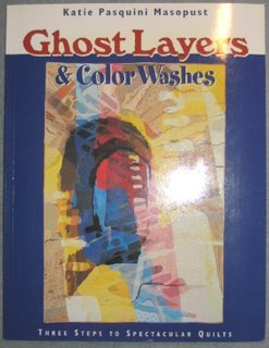
So I started to work on the design for the new theme for the abstract challenge group. Theme for this month is "Marriage". First I thought, it would be impossible to find a way to do it, but then I thought of the book "Ghost Layers" by Katie Pasquini Masopust and that her technique would be just perfect for doing this quiltlet.
 It is the first time I am doing a quilt with those Ghost Layers, so am very curious how it turns out.
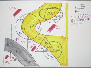
I chose two different shapes to represent male (rectangle/triangle) and female (circles). Here is the first sketch to find out which colors and hues will go where.

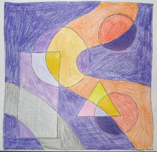
As I need color to see if it is good or not I did a second sketch with pencils. I don´t have all the necessary hues, so it is as close as possible to the hues I am planning to use.

The Color Wash (orange and grey) symbolize the ways that twist back and forth and up and down in a marriage over the years.
I am not sure about the grey part in the lower left. Not enough contrast to the purple, so I might try another color tomorrow. But what will go with the purple and yellow/orange? Red? Maybe too much. Green? Not my color, but maybe worth a try.
I absolutely love the books by Katie Pasquini Masopust. Her techniques are gorgeous and her quilts are pure eyecandy. I also bought her newest book "Color and Composition for the creative quilter". And I decided yesterday to do the lessons instead of just looking at the book on my shelf.
1 comment:
love your design!
i´d love to see a bright pink with those other colors. it contrasts to the purple and normally would be an absolute "no" with orange and red... it adds interest to a quilt to use provocant colorways.
maybe in the middle section you could calm the pink down with a white tulle layer above to give it a "foggy" look...
which challenge do you take part in?
Post a Comment